July 01, 2020
Fourth Echo Design issue! On this occasion, I’m excited to share with you an inspiring portfolio designed and developed by Nick Jones. I found it by chance as I was doing my design watch. Lucky me.
You can visit it at narrowdesign.com, this is his personal portfolio.
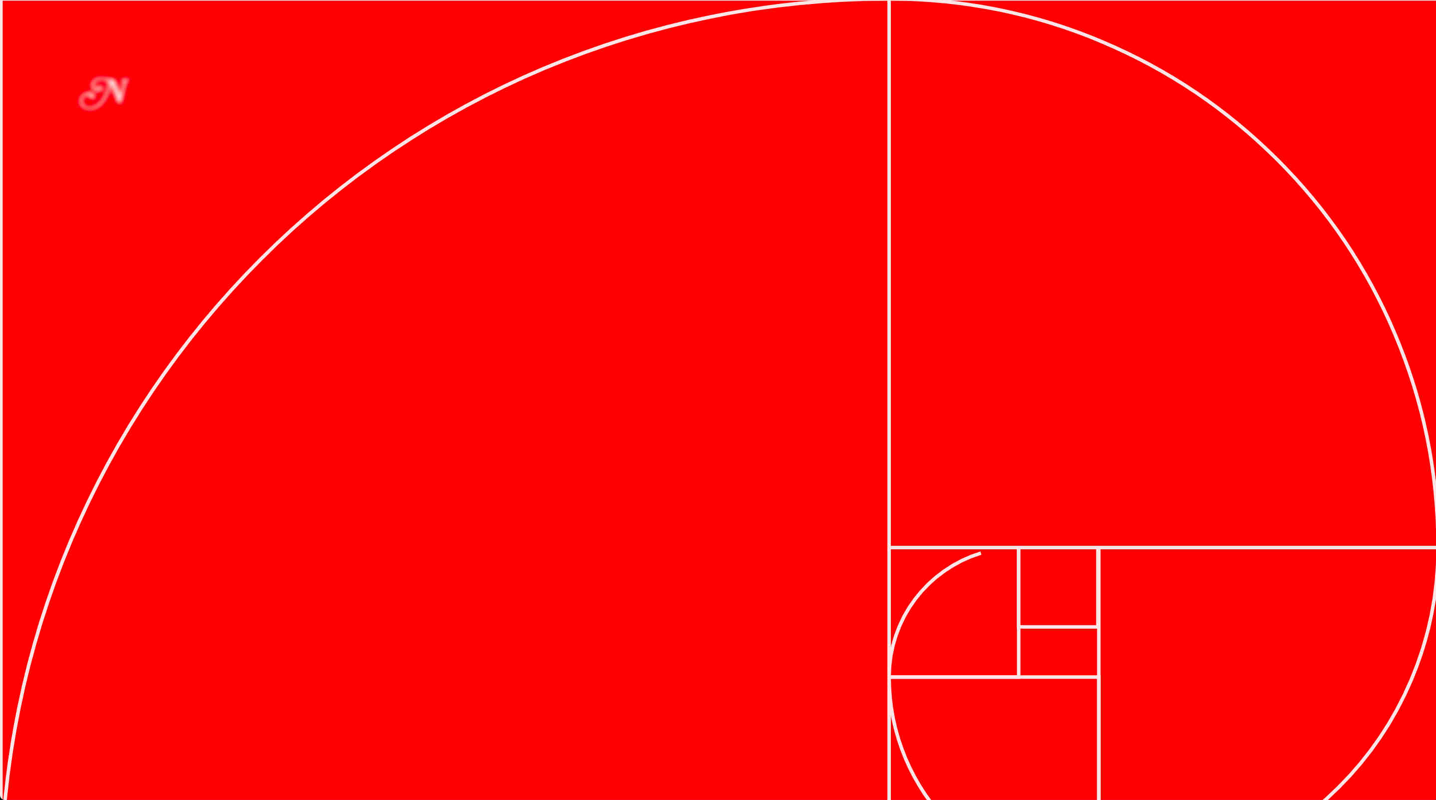
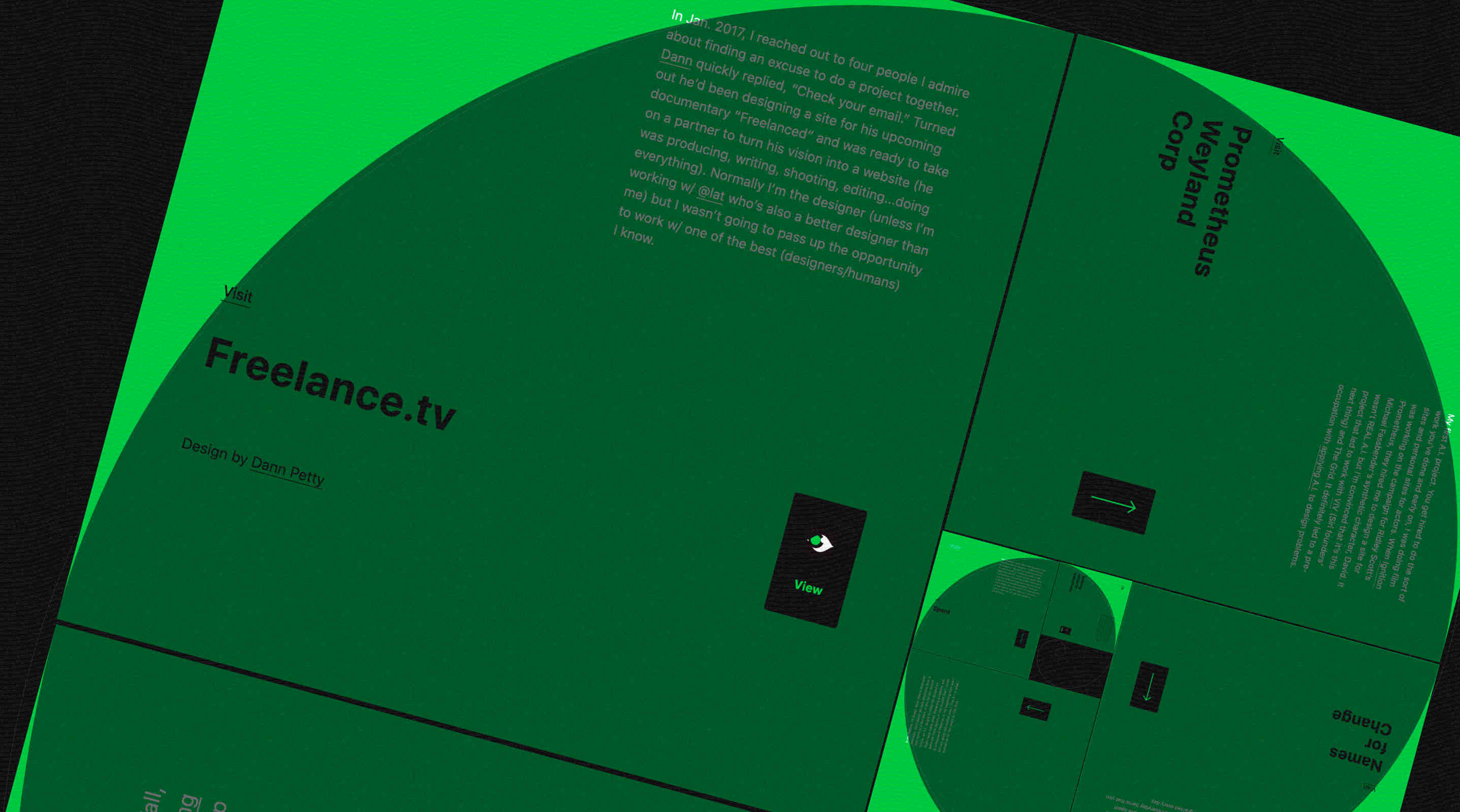
I really like the navigation experience, inspired by the golden ratio that you should know if you are also a designer. For an improved experience, use your keyboard arrows rather than your mouse to scroll between sections. In addition, when you click on a project view, your cursor is replaced by a cross and you just have to click to go back. Handy.

Another thing I appreciate, Nick thought to alert the user about the experimental interface. He suggests that people who don’t want or dislike the experience should switch to a classic version. UX spirit.
I contacted Nick and told him that I really liked his website. He kindly agreed to answer some of my questions. Here are my few discussions with him:
Kevin Bizien (KB): Hey Nick, I hope you are doing well. I was doing my design watch, I don’t remember exactly where, but someone shared your website and I clicked on the link. Nice work! After a few seconds on your website, a few questions crossed my mind and I wanted to know more. First, can you introduce yourself and talk about your professional career in a few words?
Nick Jones (NJ): Thanks for making me feel relevant Kevin! This site launched three years ago and I have been really focused on becoming a competent engineer since then I haven’t designed anything in a long time.
I’m a former kid from Minneapolis, MN who now lives in North Carolina with my wife and four kids. For twenty years my creative outlet and occupation has been designing and building experimental interfaces for the web. For the last few years I’ve been working almost exclusively on stripe.com. Before that I alternated between freelancing and working in advertising agencies, production shops, and tech startups as a designer, animator, art director, and developer.
(KB) Can you explain your favorite process for designing and coding interfaces? Are you working with design software like Figma or Sketch? Or do you perhaps code your ideas directly in your browser?
(NJ) My ideal process depends very little on the tools or technologies. It depends mostly on the person or people I’m working for and my state of mind. When my client has great taste, high expectations, no idea what they want except that it is something experimental, and they trust me, I enjoy the process. Not sure how to say this without sounding full of shit but the best design tool is a quiet mind. When the conditions above are right and I’m not just executing something predictable, my process starts in a comfortable chair with my eyes shut. I’m not a meditator but designing with my eyes shut, which is sort of the opposite of mindfulness since it involves actively directing thoughts, has become my favorite way to do it. I can cycle through hundreds of ideas in a short period if I just let my mind wander through combinations of all the design patterns I’ve tried or seen. Twenty years of trying things that didn’t work and paying attention to design accumulates a rich visual language to draw from. As easy as they are to change, pixels are resistant to change. They represent a decision that has been made and to change them takes far more effort than switching some neurons on or off. Once I have an idea I want to interact with I start creating in the browser. I try not to think about visual design early until I am convinced an idea is going to work. Coding a design (mine or somebody else’s) doesn’t fuel me creatively the way creating in code and just letting the visual style unfold does.
(KB) What were your inspirations for this design, how did you get this navigation idea?
(NJ) My desktop wallpaper from about 2012-2016 was the golden spiral with the proportions (1:1.618) labeled and the first 20 or so Fibonacci numbers. Every time I’d open my computer, I’d stare at that for a second and always thought it would make a nice website layout. The rotating idea came while I was figuring out the math to generate the squares. I was trying to figure out the smoothest way to move from one section to the next. The fonts are system fonts and the colors are taken directly from the projects which were already done. I like red so I also used some red.
(KB) Moving on to technology! Which languages and frameworks/libraries are you using here?
(NJ) jQuery and CSS. That’s all. I was embarrassed of that when I started getting attention for the site. I felt like I should’ve been using something more current. Turns out nobody cares. Clients don’t care. Users don’t care. Peers only care if there’s nothing interesting to focus on.
(KB) What was the biggest challenge on this project?
(NJ) It wasn’t challenging. Not because I am so good at this that it was easy but because it was a pleasurable process and the idea that any part of making websites is a challenge compared to actually challenging things feels too self important. Raising kids is a challenge. Systemic racism is a challenge. Staying focused in a world filled with distraction is a challenge. Making websites is a joy. I guess some of the math was hard for me to figure out. And when I saw the amount of traffic it was getting I overdosed on dopamine and meaningless metrics.
(KB) Do you want to explain anything else about your portfolio conception? Any stories or anecdotes to tell?
(NJ) I wish I had made it more of a canvas and less of a piece of work. It just sits there now and I have no use for it. I’m proud of it and it helped me get my name out there but I wish I could’ve used it as an ongoing creative platform.
(KB) Thanks a lot for your time Nick and bravo!
(NJ) Thanks Kevin.

Resources:

Kevin Bizien
UI Designer & Creative Developer
Want to tell me about your web project? Contact me at bonjour@kevinbizien.com and we can start talking soon!